
By:
Rick Stanton
President/Creative Director
President/Creative Director
Someone
has told me that they think some of my blogs are too negative.
So this blog is based on being positive.
So this blog is based on being positive.
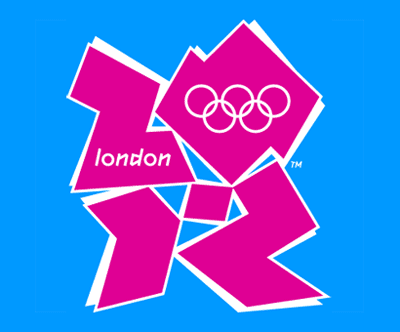
I’m positive the logo for the London Summer Olympics is one of the most colossal train wrecks in the history of graphic design.
What
were people thinking? That’s unfair; thought was not a part of this disaster.
And
given what surely must be one of the largest committee-based decision making
processes in the world, a number of influential folks looked at this and went,
“Whoa, this is it.”
This
once again proves beyond a shadow of a doubt that clients get the work they
deserve.
Of
that, I am also positive.
Tell
us what you think.


I positive I disagree.
ReplyDeleteThe fact that you can identify it as the symbol for the 2012 olympics is proof that it's doing it's job. (the job of a logo) The fact that people are talking about it means it's doing an extra job of drawing attention to the event. (the job of advertising)
So there you have it. The event will embody what it will. The symbol will mark that embodiment. And some people will complain. (But some people just need to complain - so even they are getting satisfaction from the mark as created.)
Thank you for reading our blog, we always love hearing from our readers!
ReplyDelete